Burns To Shine
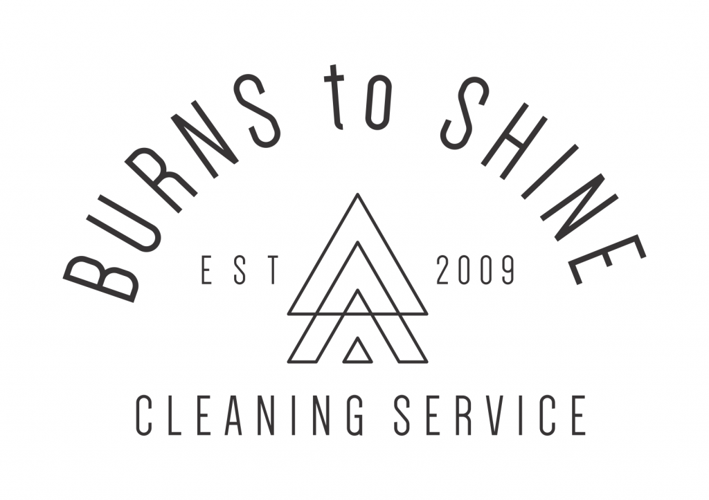
“For some reason I picture a triangle shape or two but I am totally flexible” was included in the brief. Their previous logo included a tree so I thought that using the triangles to evoke a pine tree would be an effective plan. Pine is also associated with cleaning. I also wanted a nice clean font and logo to emphasize the business’ purpose.
Leave a Reply